/ COLOR THEORY
primary, secondary, tertiary colors
value, chroma, hue
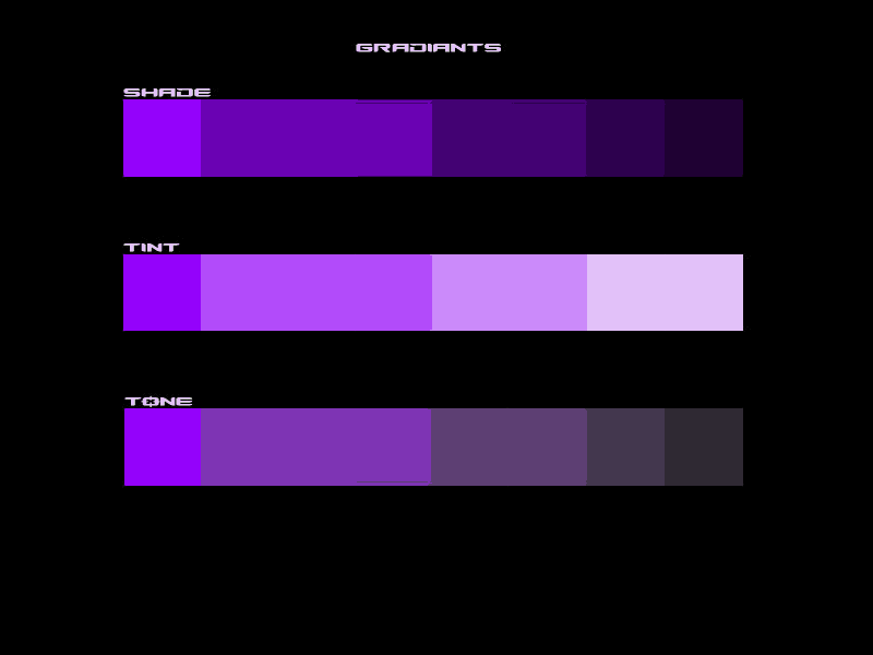
tints tones shades
monochromatic
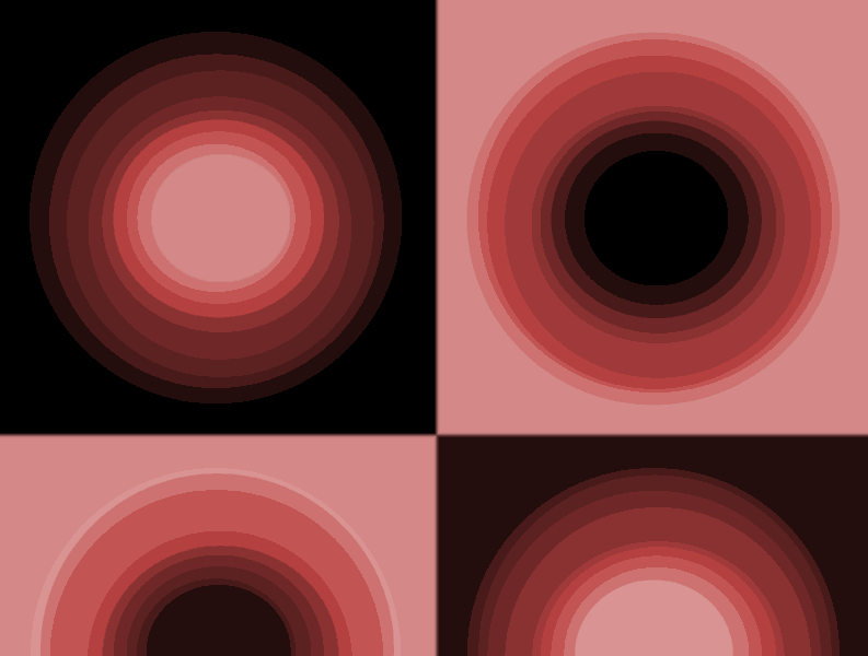
duotone
cools and warms
analogous
complements split complement triadic tetradic
Mutual repulsion


Color Theory Course Description:
In this course, students will explore color theory, including additive and subtractive color. Discussions of color and its relationship to composition, through harmony and contrast, will be explored.
Course Length: 11 Weeks
Contact Hours: 44 Hours
Lecture: 22 Hours
Lab: 22 Hours
Credit Values: 3 Credits
Core Course Competencies:
Upon successful completion of this course, the student should be able to:
Compare and contrast hue, value, and saturation
Apply the concepts of unity, variety, contrast, dominance, appropriateness, balance, and harmony to their design
Compare and contrast additive and subtractive color theory
Distinguish the relative aspects of color perception (e.g., psychological and cultural aspects) as they apply to solving design problems
Differentiate between color used as symbol, as expression, and as description
Identify and define which color theories apply to different input/output devices
Identify color choices
Demonstrate the design concept visually through sample boards, etc
Field trips
La Jolla Museum of Contemporary Art
Fashion Valley Mall
Resources
techcolor.com pantone
fred.net photoshop
colorschemer.com
color.twysted.net/ r
copymyths
color-wheel-pro.com
Artist's color wheel
colormatters.com
colortheory.html
worqx.com/color/pantone
SAMPLE ASSIGNMENTS
Text as a graphical element
Problems in an individual piece tend to fall within these five categories: inconsistency of style, idea, or feeling failure to determine basic structure tendency to ignore negative space, inability to develop value range and transitions, failure to observe accurately." From Critical Assessment from Drawing, A Contemporary Approach 4th Edition Betti/Sale
This project deals with negative space and composition through dealing differently with a common positive form: text.Text/typography is often placed into a composition as if it weren't a graphical element - a designer may shift gears and start thinking about writing, or reading when they leave the image and start placing text. In fact,type works like anything else - it's a compositional component.
In this exercise, we break from preconceptions about legibility and traditional typographical form and allow the letters and numbers to combine, mutate, evolve into a new shape that is equal to the negative space, as important as any art mark or stroke. The colors must be cool. Blues, blue violets, blue greens. We created a project using warms previously. Now push the limits/try your hand at cools. Extend your range. The text forms must be illegible, unrecognizable, new, mutant.
The project must be submitted in a clean unscratched jewel case. It must be perfectly crafted. Take an existing insert out of the case, use it as a template. Make sure edges are perfectly cut, trimmed, folded, and that there are no gaps or spaces. Use good quality paper for your printout (glossy, photo paper). No late subs. Media open.
Self Portrait
In the self portrait you can use any color, and combination of tones, tints, and shades. The emphasis will be on how you communicate a feeling,
The text lists a wide range of concepts: romantic, sexy, vital, friendly, dependable, classic...and the author's interpretation of the colors associated with those ideas. You can add your own, or reinterpret hers.
For example, her DELICATE is done with tints and pastels. Yours might be silver and black. I have often considered pink to be perfect for conveying something disturbing. The cultural cliche is sweet, sexy, romantic.
You'd be wise to investigate self portraits done through the ages. It has a long tradition.
Try some of the links on my art history page - they link to 2 or 3 very robust sites cataloging artists and their works, from prehistoric to contemporary.
The media is open as before: posters, postcards, CD covers, prints, t shirts, web designs, video projections, 3d models. You may use a photograph, a mirror, paint, marker, digital media (600 x 800 72 dpi with correct naming format).
The subject matter is yourself, but the interpretation can range from representational to abstract.
CA Life
Create a design for one of the following: a skateboard, snow board, or surfboard. The theme title has to be included as part of the presentation. See your text for examples of color/theme relationships.
Browse around for a template to fill and alter, or photograph someone's skate/snow/surf board. Tip: Go to a local surfshop (Mall) and get a free surf/skate publication. Scan a board from one of the ads (at 150 dpi) and you'll have a good quality image to make into a template. Jpgs and web images generally will be lossy and have poor edges.
Digital format 600 x 800 or perhaps a panorama, 600 x 1200 or more, scrolling horizontally (see my artworks section for an example of this). Digital works present 4 designs.
If you are working analog make it bigger than what we have been seeing, perhaps 2 sheets of paper wide, or 24".
Non-digital works can be one design.
Consider collage, cutting out the form and pasting it onto a board or some other surface, printing/painting directly onto the surface of a board, or presenting a freeform model not glued to a rectangular surface.
Do some research on surf/skate culture. Go to a surf/skate shop. Do a google search for images and ideas.
At LMCA there is a great book on skateboard graphics.
There is a substantial history of board graphics. Some of the most cutting edge design has been developed in this industry.
Environs
Interior/Exterior Environments, Personal Palettes
Create an environment, exterior or interior (your choice). The environment must include some sort of signage. The environments in the past have been enclosures or habitations where you live.The signage can include vital
Create a palette, either from your environment after you have created it, or create your palette first, and then create your environment color scheme from that palette. Use at least 25 different colors. The palette can be placed as a compositional element or presented off to the side.
The project becomes clear when you view the macro cityscape online, with the clickable views of micro environments.Procedure for creating a palette in photoshop will be covered in class. You can get colors from images, photos (see simcity images), you can pick them from the color picker, or you can read the hex number from a web page and enter it in photoshop (eboy, find bg) things to cover in demo: picking a color, entering a number in to find a color (eboy, find bg), pasting color into selected areas, copying and adjusting colors with hue and levels to create new
colors -note
tones
scale of color/chroma use (warm and cool - see Tufte, see virtual environment examples)
transparent overlays
scale used in composition
text color