2D Design
Overview. The projects listed here were developed and implemented for the Art Institute San Diego where color theory is taught separately from design. They are for design majors (not fine art/studio students). The result is an illustrative and graphic sensibility, a digital focus. This is not a university program.
Sample Syllabus
Texts:
Principles of Two-Dimensional Design Wucius Wong Principles of Color Design Wucius Wong
Visual Literacy: A Conceptual Approach to Graphic Problem Solving Judith and Richard Wilde
Creativity for Graphic Designers Mark Oldach
The End of Print Blackwell/Carson
A Design Manual Shirl Brainard
Understanding Comics: The Invisible Art Scott McCloud
Composition Sarah Kent
Design Elements
Point. The simplest, most basic design element. An extended point creates a line.
Line Types of line: thick, thin, heavy, light...Line relationship to shape, value, texture, pattern, space. Expressive line.
Shape Types of shapes: big/small, organic/geometric...Relationship of shape to development of space (positive/negative, shallow/deep, near/far) form, volume, dimension.
Form. Shapes create forms, but this element is also referencing the overall form of the artwork, its composition, unity, emphasis, subject matter, formal qualities.
Texture. Simulated (copied from nature) and invented. Skins applied to forms.
Space/Scale. Types of space: 2D, 3D, psychological, flat, volumetric...Relationship of art elements to development of space through overlapping, raised and lowered base/horizon lines, scale, value, foreshortening. Geometric perspective/ atmospheric perspective (advances through increased contrast, detail, and resolution, larger size, lower on horizon, recedes through less contrast, less detail, lower resolution, smaller size, higher on horizon, softer edges scale/size.
Color/Value. Types of color: monochrome, duotone, analogous, warm, cool, chromatic and achromatic colors...
Terms: chroma, hue, tint, shade, value, complementary, split complements, opaque, transparent, primary, secondary, tertiary.
Color concepts: subjective color, expressive color, local color, mutual repulsion, push/pull.
Relationship of value to the development of space, pattern, texture, shape, form, figure/ground.
Expressive use of value: chiaroscuro, modeling, local, interpretive.
Design Principles
Balance. Symmetry: the use of the same elements and equal visual weight on either of a central axis (formal) Asymmetry: the visual balancing of elements which are dissimilar. (informal)
Movement/direction.
Emphasis/dominance. Produced by giving greater visual importance to certain elements than others. Relates to focal point, center-of-interest, contrast.
Unity. Harmony: strong visual relationship of design elements within a composition, achieved through repetition or similarity of elements/characteristics. Too much sameness results in visual monotony.
Variety. Slight or strong contrasts, positions, changes among design elements. Too many may result in chaos.
Contrast. Achieved through value, color, scale.
Pattern. Repeated shapes, texture, value, color.
Mood. Established through value,color, contrast.
Rhythm. See repetition, pattern. Results in continuity, flow, movement.
Composition and Structure
Concepts and Vocabulary.
Negative space, proportion, dominance, form, structure, reflection, repetition, representation, abstraction, non-objective, gestalt, meaning, function, framal reference, picture plane, positive space coinciding, dilation, detachment, touching, overlapping, penetration, union, subtraction, intersection, open forms, closed forms, organic forms, geometric forms, symmetry asymmetry, dynamic, static, formal, informal, translation rotation.
Concepts and Vocabulary for Projects or Critique.
Simple/complex
Unity/fragmented
Active/static
Transparent/opaque
Sequentially/randomness
Consistent/varied
Neutrality/accent
Regular/irregular
Understated/exaggerated
Subtle/bold
Accurate/distorted
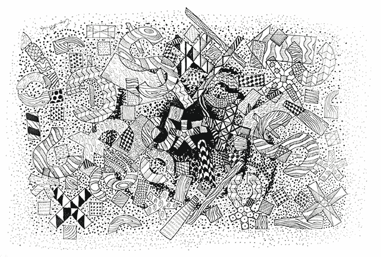
Unity
Create a design of your choice that deals with the principle of unity. This is a get-to-know-you assignment in the sense that it’s a chance for you to present your influences, sources, and individual stylistic directions in your work. It’s also an opportunity to integrate information you have encountered in your reading concerning unity.
Source materials
Introduction, Chapter 1 and 2. We will critique these next class. Craft is going to be an important component.
Materials
Open. If you are using collage or appropriated imagery, be able to discuss copyright issues, and incorporate the images in such a way as the authorship is more about your artwork than the original.
Format
analog/hand-drawn: 11 x 14" or small2aer. Scanned and Saved for Web as a jpg or gif 600 x 800
digital: 600 x 800 72 dpi RGB. Saved for Web as a jpg or gif.
Scan/format tips
scan at 150 dpi
open the image in photoshop
command Image/image size
uncheck the resample box
change the dpi to 72
recheck the resample box
change the pixel dimensions - making sure constrain proportions box is checked.
save for web as a jpg or gif. check quality settings
Summary
read the text
make a design dealing with unity and style
scan it if it is a drawing, illustration, or collage
bring your digitized projects in on a zip, cd, usb device, web page, or on the transfer server for critique next tues.
Artists to look at: Frida Kahlo. Matisse. Mondrian. Picasso (he changed his style many times during his career), Rothko, Kruger.
Contemporary artists often change styles, or adapt style, formula, materials to a particular venue. See Ann Hamilton who does large-scale installation. Manny Farber changed his style from large-scale minimal abstraction to a unique, fly-eye still life.
designboom.com/eng/
Emphasis
aesthetic (artistic)
values
abstract, non-objective
focal point
contrast\
visual emphasis
accents (secondary points of emphasis)
value
saturation
hue, color
monochromatic
duotone
symmetry
asymmetry.
Use one or more of the previously described methods of achieving emphasis in your composition.
Examples


Scale
Purchase a normal-sized postcard
Collage over the ENTIRE front of this postcard. Consider scale as the theme. You select the subject matter. Mail it to me and I will bring it in for the critique.
Review the information in chapter 4 and apply to the following project.
Objectives:
To create an image that deals with an aspect of scale as set forth in the text.
To increase skill in collage, glue, cutting: craft.
To experience a limited size format, explore the conceptual aspects of scale.
To integrate previous material into the current project.
Notes
Although digital manipulation can be utilized to create components, there has to be physical cutting, gluing, trimming. Magazines, photos, web downloads, clip art are all acceptable. Respect the integrity of the artist who created the original image. Be original, as this is one element being graded throughout the quarter.
If you are printing from an ink jet printer, especially onto matt paper (glossy recommended), you may damage the image when removing the rubber cement later. Use gloss or some other durable matt. See demo.
If you are trimming thicker paper, you may need to make several passes for a clean cut. Use a sharp knife.
I place my glued elements under a heavy book for flattening.
Craft will be graded heavily. No torn edges, wrinkled collaged elements – unless they are meant to be there
Student gallery - postcards mailed to me


Balance
Continue developing skills in craft and execution.
Increase understanding of the principle of balance.
Integrate previously covered elements and principles into an original design.
Create an original composition that utilizes/combines three words from the list below. The emphasis is on demonstrating the principle of balance. Previous elements and principles should be incorporated in the design. The imagery can be representational or abstract.
Format: Open
Materials: Open. Brainstorm with thumbnails, arranging the elements in symmetrical (formal), asymmetrical (informal), radial and crystallographic balance. Select a composition and execute using materials such as pens, markers, charcoal, pencils, collage. On the back of the composition (or very small in the border of a digital file) , write the three source words, and your name.
Evaluation
Presentation is free of distractions. These include rough cut edges, tears, excess glue, dents. Color, value, and tone have been considered; colors are rich and saturated, line work is varied and eloquent. Materials belong together. For example, marker (which absorbs light) often clashes with graphite (reflective). The composition’s primary focal point is balance.


Line and Rhythm
Review the information in chapter 6 and 7 and apply to the project. Create a composition that incorporates elements of line and/or rhythm
Objectives. Develop skills in mark-making, drawing, repetitious shape placement, continue to develop sensibilities in digital and non-digital presentation
Format: open. if digital, 600 x 800 max (altho exceeding that dimension in one direction is acceptable. If digital, place in the inbox using the naming convention covered in class.
Materials: open. Any cuts should be exact. Any mounting board should be perfectly cut as well.Review the examples here, and in the book. Between Bridget Riley (100) and Charles Burchfield (108) Your image may be completely different, or a composite.


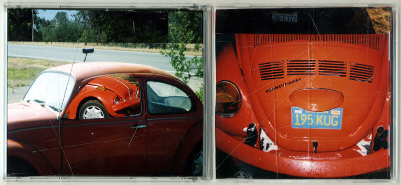
Shape and Volume
Review the information in chapter 8 and apply to the project.
IMPORTANT: Apply the information we have covered so far into the composition as well - this means integration of elements of scale, balance, unity...
Format: CD size graphics presented in a CD case.
Remove the graphics from a CD case.
Create an exact blank copy of the insert. This will be your canvas.
Materials: Open. However, all images must be original. If you use buildings, people, other objects, they must be photographed, digitized, printed and collaged by you. No clip art, magazine or internet images. Any text must be created and printed by you as well.
Content, subject matter: Pick a catagory from the Shape/Volume chapter as your theme. Extra consideration should be on mass and volume, either the complete flattening of the shape and space, or an emphasis on volume, form. Lighting, chiaroscuro may be considerations.
References
Caravaggio for examples of chiaroscuro /Link
Superflat japanese artists http://www.designboom.com
Google image search for Takashi Murakami
Presentation will be weighted heavily. Craft. Neatness. Contrast. Color. This should be portfolio ready.


Space
Review the material in the text for space, value and color.
Create a composition that develops deep space, the Z axis.Your composition is a window on a world of infinitely deep space. How do you do this? Perspective, both linear and atmospheric. Color, saturated and desaturated. Scale: Big medium small shapes. Overlapping. Format and medium are open.
This is one of the final projects, so it should reveal your comprehension of the material covered previously. Presentation should be impeccable.Ideas include portraits, landscape, abstractions, cd covers, posters, web designs. This can and should be a portfolio piece
Check out the links below to view De Chirico's distorted linear perspective and Da Vinci's atmospheric perspective.
artchive.com
kfki.hu see 1480's


Motion
This is the final project. It should demonstrate an understanding of the material covered in the course as well as the principles of motion.
Create a composition that illustrates the concept of motion
Your text lists three: repeated figure blurred outlines multiple image.
Media and format: open


